I’ve posted this chart before, but I’d like some input from folks who actually understand this stuff.
If I understand it, the dashed lines are my prescription and the solid lines are the settings. I’m not sure, but the highest line seems to be the amplification for the 50db range, while the lowest should be for the 80db range. Here’s my conundrum; I watched the audiologist use real ear measurements to match one line directly on top of the other line for all the ranges, so why would the prescription be so far off of the settings? At 3000hz the prescription of the highest line seems to call for 24db of amplification, but the settings seem to call for about 15db? Could it be the acceptance program lowering the settings? I started at 90% over 4 weeks, some I’m a shade over 25% (8 days in) to target. Please help me know where these numbers are coming from. Jabra Pro 20’s using resound Smart Fit 2.0.
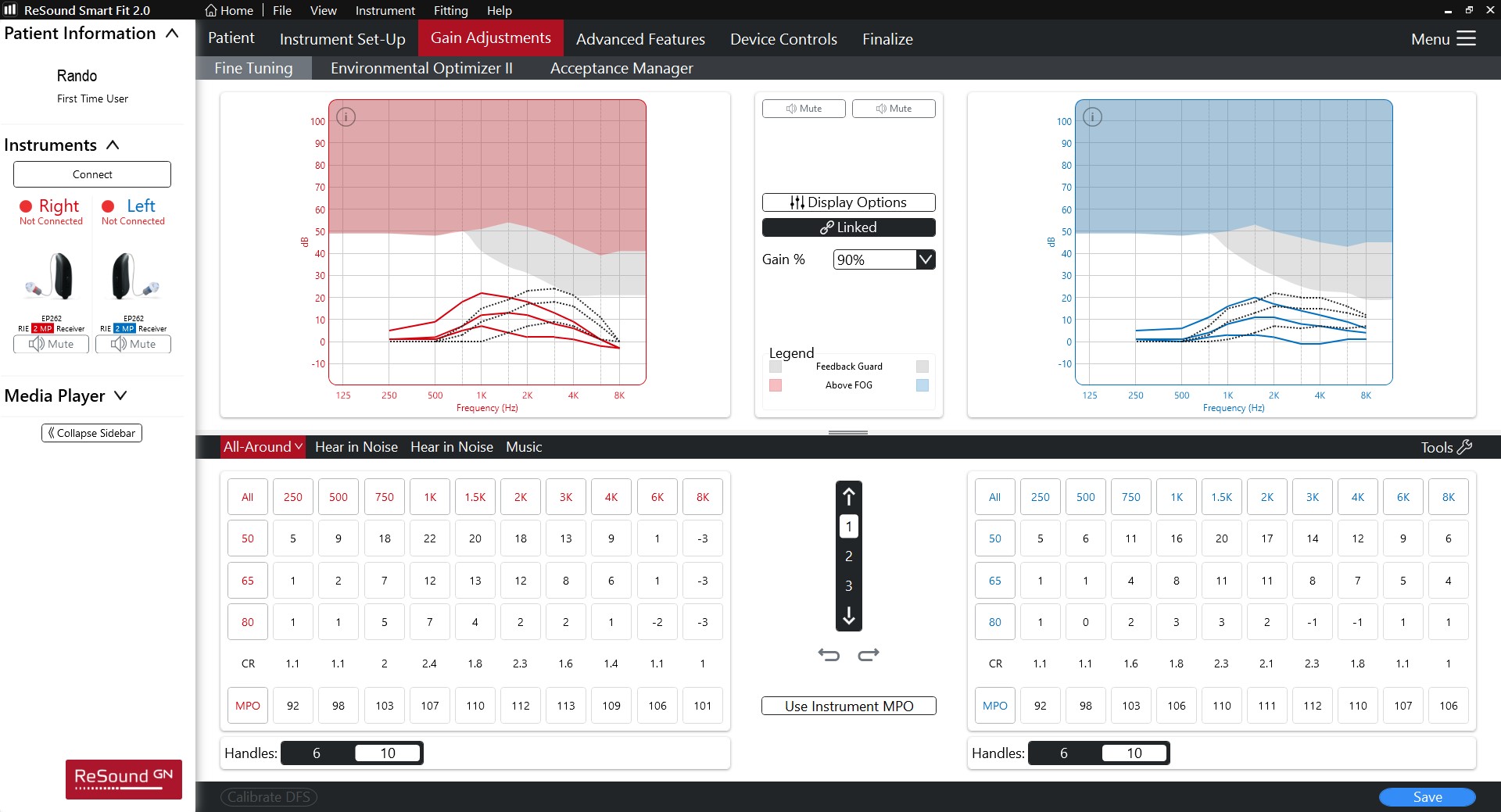
Hard to know without seeing your REM. You don’t have it, do you?
Two reasons these lines differ from REMs:
-
The dotted lines are blind precriptions (i.e not taking into account the unique size, shape, and resonance profile of your ear canals - i.e. assuming you have average size canals).
-
the dotted lines are prob the manufacturer’s proprietary formula, whereas your AUD probably used NAL-NL2 or DSL.
Hope that helps.
Depending on the REM, it looks like the prescription has been biased to compensate for a large vent.
High frequency gain looks on the thin side though.
Neville,
Unfortunately, no.
Louie,
I’ve got the data out of the heaing aids as configured, it’s NAL-NL2.
Um_bongo,
They have me wearing large vents, so you’re spot on.
Thanks to all that replied. I think the voice spectrum is still a little weak, because I still occasionally find myself saying Pardon?, or Say Again?.